Headings are a great way to title sections of text to chunk up information into sections. While visually we have made headings in documents by adjusting the size, color and font qualities, we have been ignoring using the headings in the styling menus provided in our rich content editors.
Styling Menu?
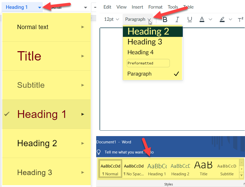
In Microsoft Word, Google Docs or the Rich Content Editor in Canvas, all of these applications have some form of styling menu as shown in the image below.
These can be used to set a text as a heading or paragraph (can also be known as “normal” in document editors). On an empty line you select the style and begin typing. With headings after pressing enter to go to the next line it will typically default back to paragraph styling. The best and more precise way to apply styling is after you have typed everything up in normal paragraph styling with all the line breaks, highlight the text selection and click on the styling you want to apply. This can prevent accidents with applying styling to the wrong areas of the page or document.
Heading Hierarchy
The two rules for using stylings in an accessible manner is that the headings need to be in a logical order and headings don’t break hierarchy. In Word or Google Docs, you want Title to be the top-most styling after which you can use Heading 1. (Heading 1 would be the top most header in Canvas and other web rich content editors). Under Title you can place paragraphs and other Heading 1’s and if you want a sub heading for Heading 1 you can make a Heading 2 styling. But you can’t skip to Heading 2 until there is a Heading 1 since Heading 2 is a nested subsection of Heading 1. Same with skipping to a Heading 3. The best way to think of structuring headings is to think of them like nesting dolls encapsulating parts of your page or document.
Don’t Like the Default Styling Look?
Don’t pick a heading based on the way you like its size or formatting. You don't want to break heading hierarchy. You can easily change the look of a style so that it is reflected in the entirety of the page or document. Here are resources and advice for how to change the formatting of the different stylings:
- Microsoft Word: Customize or create new styles
- Google Docs: In Add a title, heading, or table of contents in a document, look under “Change the text style”
Other Good Things Know
- Headings are not necessary in emails since most emails tend to be shorter form. Most email rich content editors don't even have a styling menu.
- If you save a PDF from a Word document or Google Doc, any of the proper stylings and accessibility considerations will be brought over and help with making your PDF document accessible when it comes to tagging and read ordering.
- We suggest not using headings that go beyond Heading 4. To make the headings look like subsections they have to get smaller in size. As you get to Heading 5 and beyond, the font size starts to get close to the size of the normal stylized text.
Other Resources
- Headings on UMN AccessibleU
- The Digital Accessibility Badging Program is a great place to learn about digital accessibility

