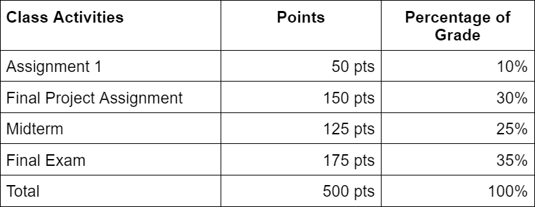
Tables are a great way to show the relationship between two or more sets of data in an organized way. In many cases though, there are considerations with tables that are missed or they are used in ways that can be challenging to read for users that use screen readers. This tutorial will cover those considerations for the correct way to make tables accessible as well as alternatives to tables.
Include Row/Column Headers
Screen reader software can read the row and column header for each cell before reading the content in the cell. This can be useful to understand what the cell in question is representing. In many cases, while headers are often included in tables, it might only be visually so and this can impact how screen readers work. Tables have special header tags, <th>, that represent what the headers are for a column or row (column and row headers can both be used if needed). In many cases there are properties or tools for tables that will help you set row or column headers. See Other Resources below for more information on where to set headers for tables.
Every Cell Must Have Content
When reading a table, blank spots may indicate an accidental omission rather than data that is not available or null. According to the AccessibleU page: “Screen reader software may skip reading empty data cells, causing mismatches between header rows and their corresponding data cells.” For these reasons, you should always have a cell filled out.
If there is no data available for that cell, insert “Not available” or “N/A”. If there is no value, enter “0” or “Null”.
In cases where the top left cell is empty (like the image of the table above), use that as a header for the contents of the column or row depending on what makes sense for your table.
Avoid Complex Tables by Merging Cells
You may have seen tables that that try to combine themes of headers by merging cells together and look like this:
While it makes sense visually, it will not work well with relaying the information with a screen reader. In the example above it will be confusing for the screen reader to know how to relay what the header for the “175 pts”. Is its header “Exams” or “Final”?
Try to simplify tables so the header on the column/row has a 1:1 relationship like the table below:
Other Resources
Check out the Tables article on the UMN AccessibleU website for a general overview of tables and accessibility
For more resources that can help you with Tables and making them accessible in the chosen application you are using:
- Table Accessibility in Canvas - Instructor blog post that talks about how to adjust table settings to make them accessible in Canvas
- How do I use the Accessibility Checker in the Rich Content Editor as an instructor? - The accessibility checker in Canvas has a wizard tool that can help with setting the headers for tables.
- Create accessible tables in Word


